What’s the point if nobody remembers us?
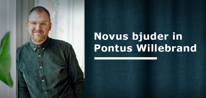
Novus has invited Art Director Pontus Willebrand, who shares his thoughts on branding, design expression and graphic identity, among other things.
“A brand that is unique and instantly recognizable has a greater chance of sticking with consumers and being remembered.”
A design expression or graphic identity is basically a tool to increase sales, membership or fundraising. The most important task for the brand’s visual expression is that it must be the shortcut to creating a memory – if we remember the brand, the probability is high that we will consume it.
When sales are slow or when you only have to make the same kind of graphic expression all the time, the idea of “taking a holistic approach” to the brand usually appears. Common arguments to reinforce this idea are, for example, that the brand feels out of date or does not appeal to a certain group.
The majority of all potential customers will not stop and reflect on what exactly your design is trying to say among all the other impressions that swish by during a day. The key lies in distinction. The distinction. A brand that is unique and instantly recognizable has a greater chance of gaining traction with consumers and being remembered.
We understand brands by category, which is really quite natural. We sort breakfast cereals into the category “things to have on the plate when we eat breakfast”, and on a more general level we put them in the breakfast category. It is important for a brand to understand its category. What visual expressions are known in the category? Which ones are distinctive? What makes us easy to recognize? Based on such an analysis, we can begin to understand the potential of our logo, our graphic elements and other expressions.
The purchase choices that are made are often the result of a long process, where we consciously and subconsciously built up associations to a certain expression. A choice is often already decided before the customer even steps into buying mode. The Harvard Business Review recently showed that approximately 90% of B2B sales are made by brands that were already present when the research began.
It tells us something about the importance of building functional and simple routes to awareness. Something that good strategic design can provide.
One of the reasons to be careful about making too big changes is about the relationship we build with a brand through exposure. It shows the classic example of the internationally famous orange juice that lost 20% of its sales in two months after a major redesign.
If the customer does not remember the sender, the good thoughts about a brand do not matter. You might disappear in the crowd, or in the worst case – be perceived as someone else. If your primary branding elements are category markers, or look like another player, then you risk spending a lot of resources on reinforcing someone else.
All of these are things that can be measured, compared and quantified. How strong are your visual elements or assets? Set up a couple of important parameters to get a handle on how easy your expressions are to remember and attribute and start the work from there. That way you can achieve the point – to be remembered.
Byline:
Pontus Willebrand is Art Director, brand strategy teacher and founder of the agency Pushing Buttons. Since the start in 2018, Pushing Buttons has been working strategically and operationally with communication for social actors and actors with social involvement.


